It's wildfire season in California. After a week heads down buried deep into the computer writing performance reviews for work, I was eager for a summer Tahoe weekend to relax. Too bad - the smoke decided otherwise and blew in THICK Friday night. Thick enough to blanket the sky and make it pretty dark all day - I slept in well past my normal waking time at 6 just because it was so dark.
By Sunday afternoon, I'd had my fill of indoor gym + Xbox (Gears Tactics is awesome, Haven is ok...too repetitive) + ads for Peacock (watching the Olympics, DID YOU KNOW IT'S AVAILABLE ON PEACOCK!?!) and decided to give into some itchy eyes just to get outside and breathe in some nasty air. Maybe one day I'll look back on these pictures and think "wow, remember when CA had all those fire issues? We've really fixed that!" I'm skeptical... Next election, I'll vote for whatever candidate has even some semblance of a plan to address this.
A human element
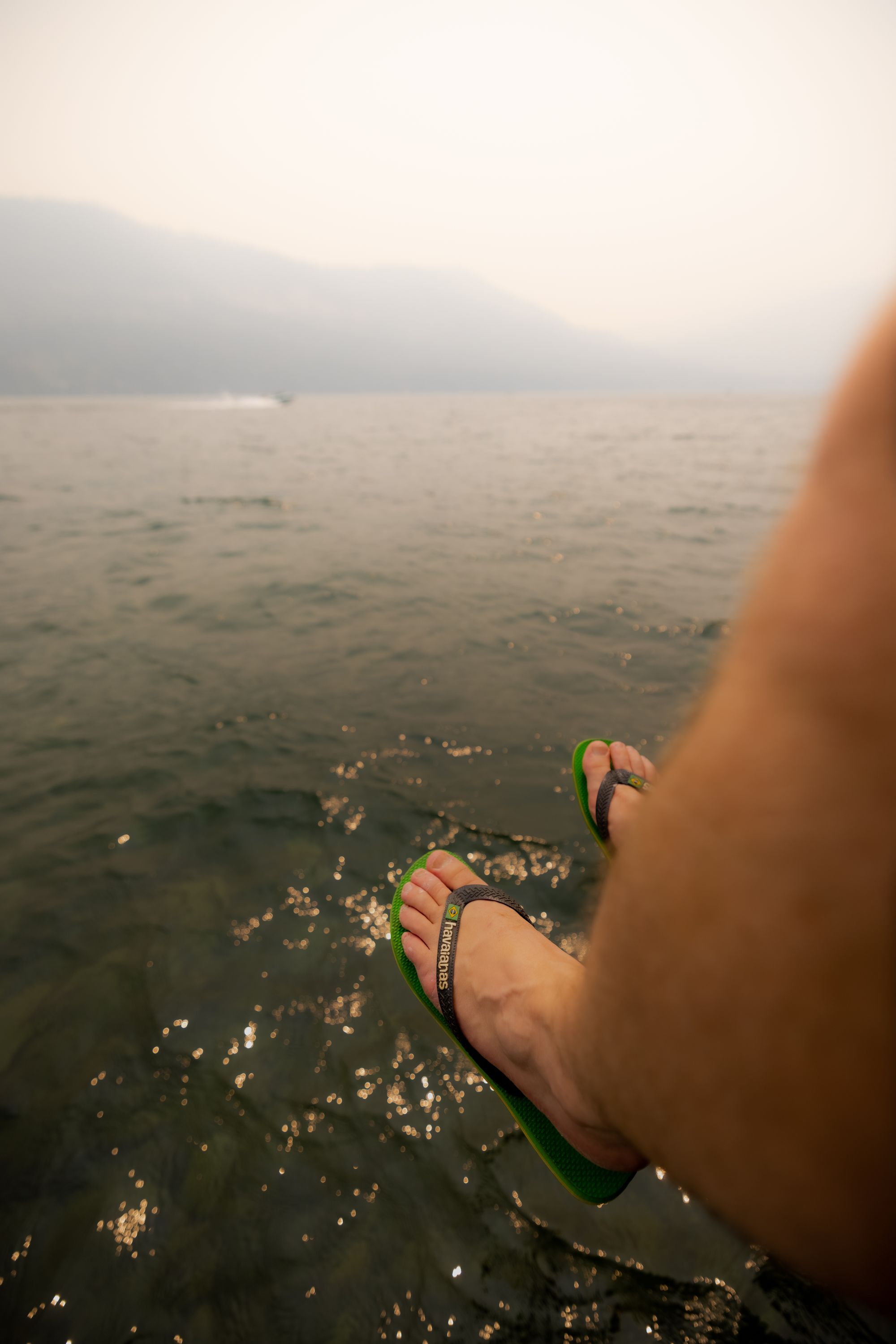
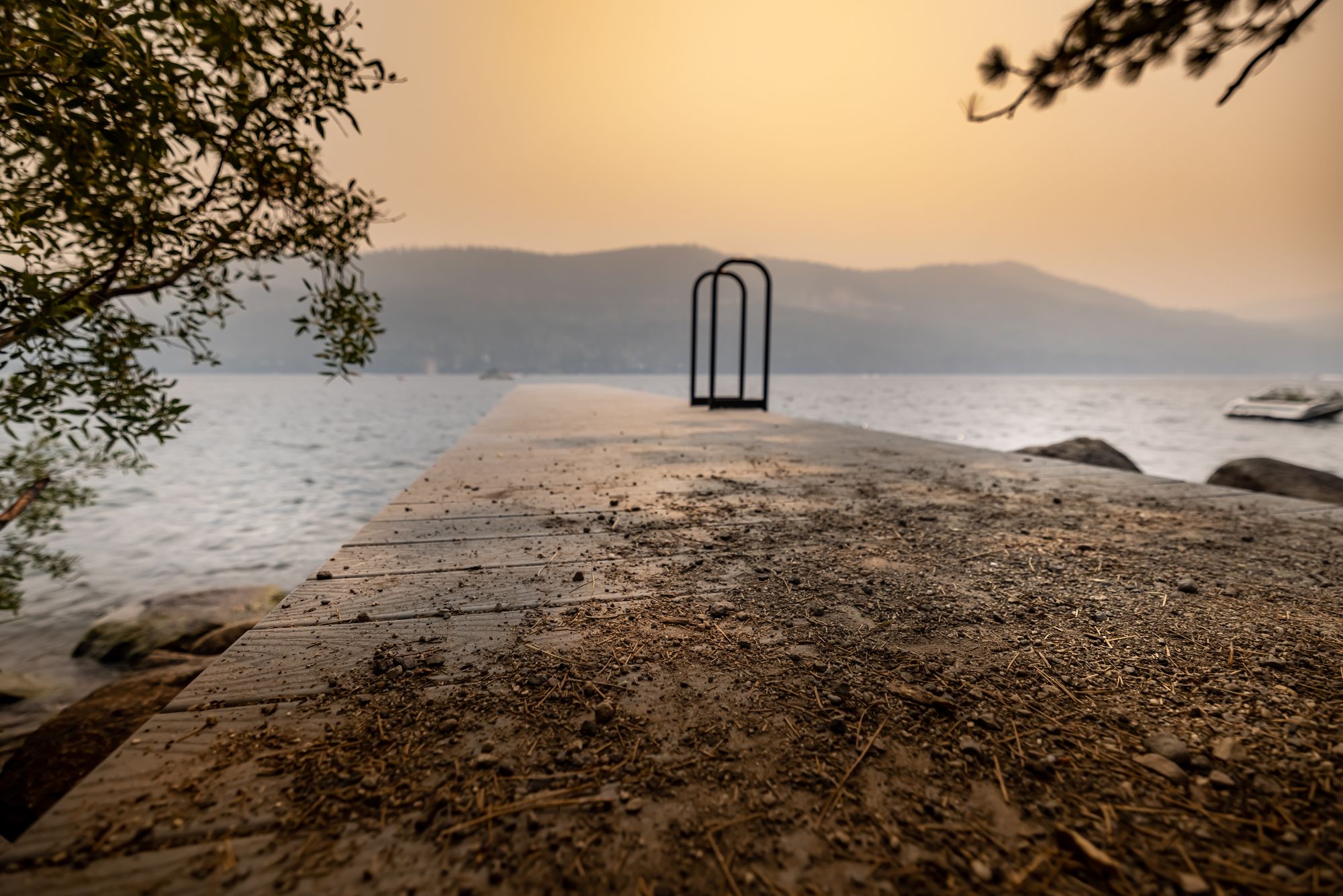
Goal: Get one pic that captures how lame the smoke is in the summer.
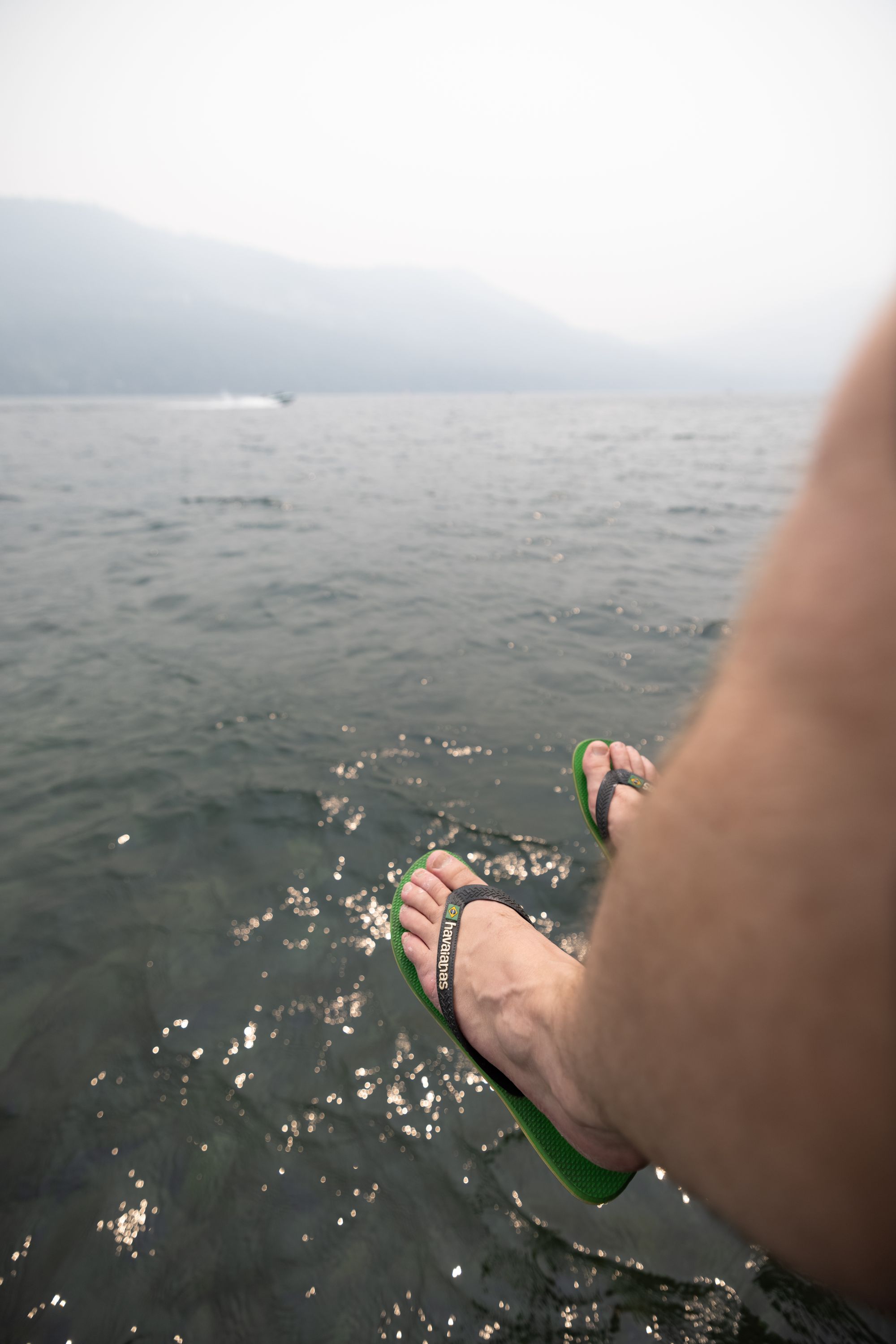

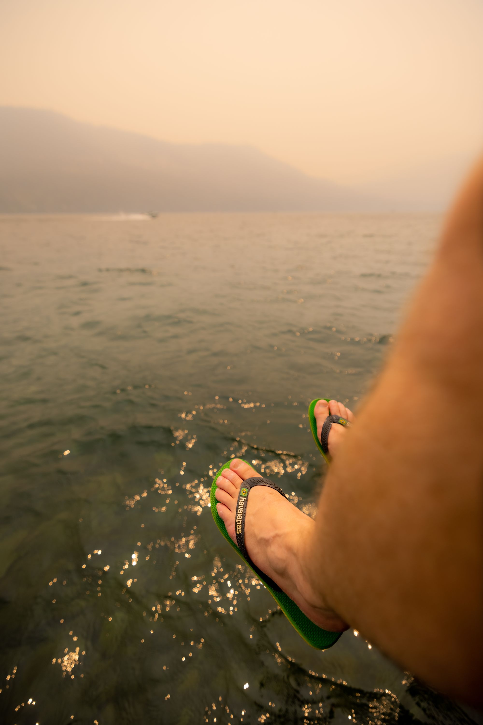
I like the human aspect in this one, and the boat cruising by on a mostly empty lake. This was a pretty quick edit.
- General updates. Really dropped clarity and texture.
- Added some orange/yellow to the sky to sell the smokey aspect.
- Whitened up my skin. I'm not that tan.
Artsy
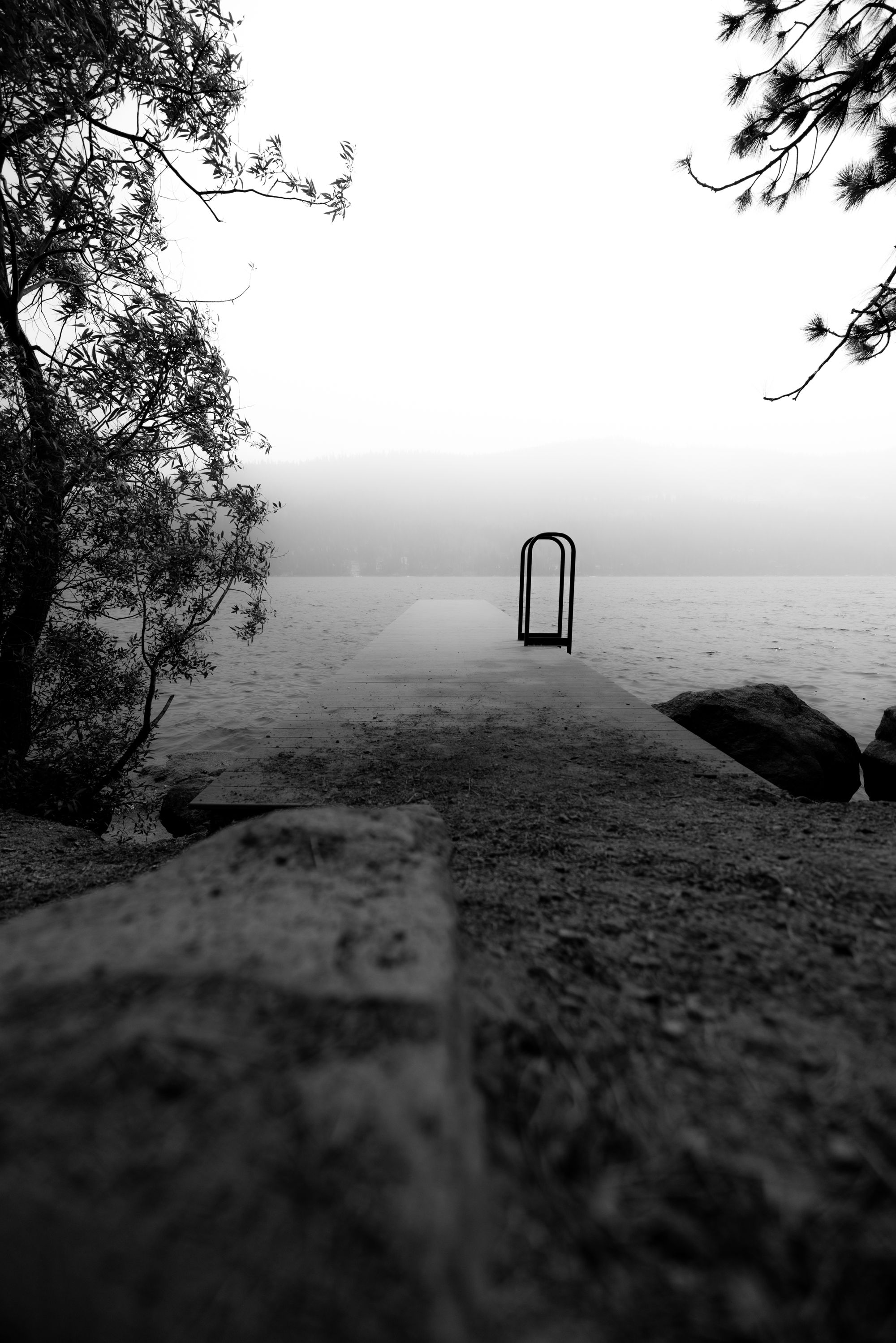
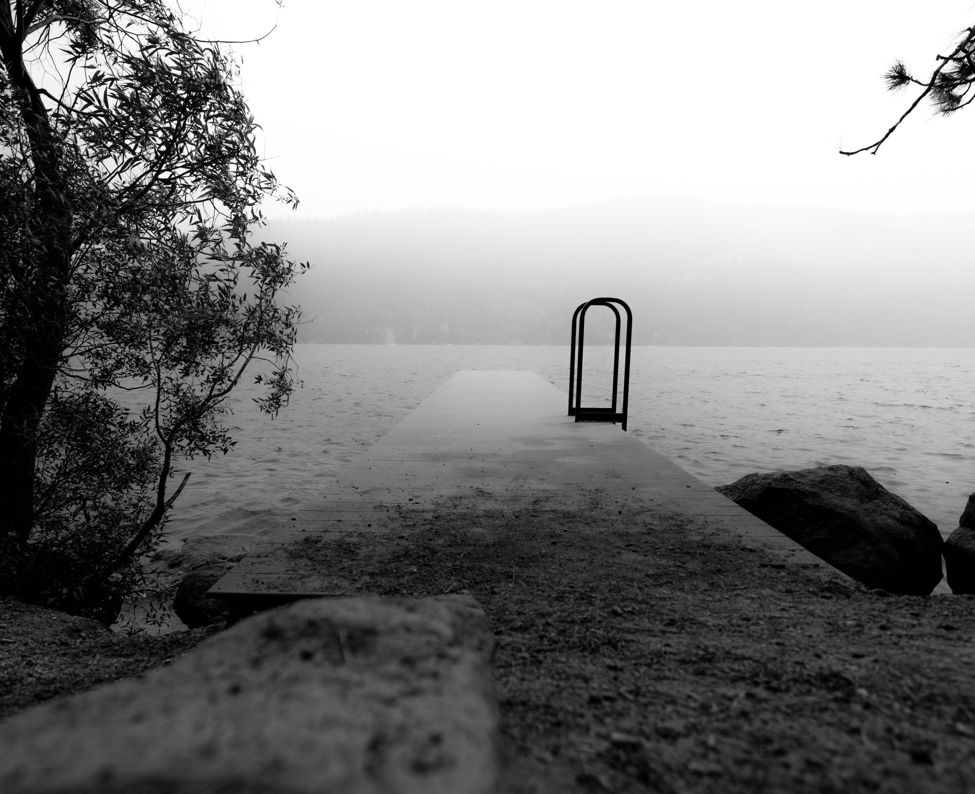
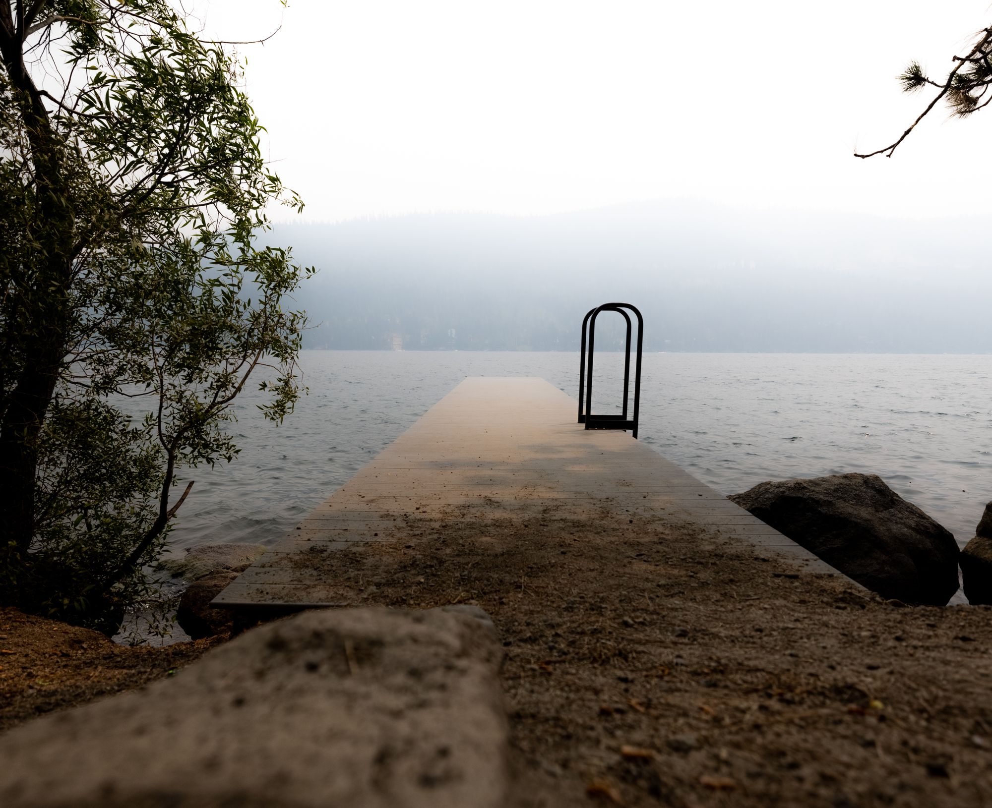
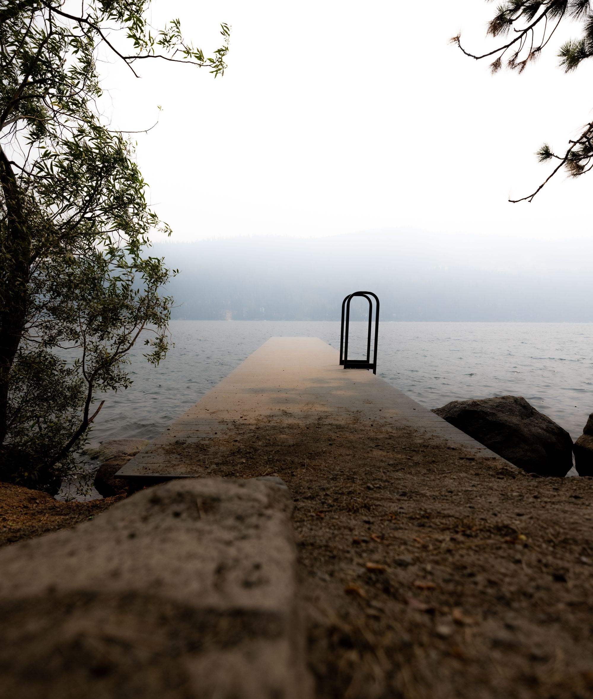
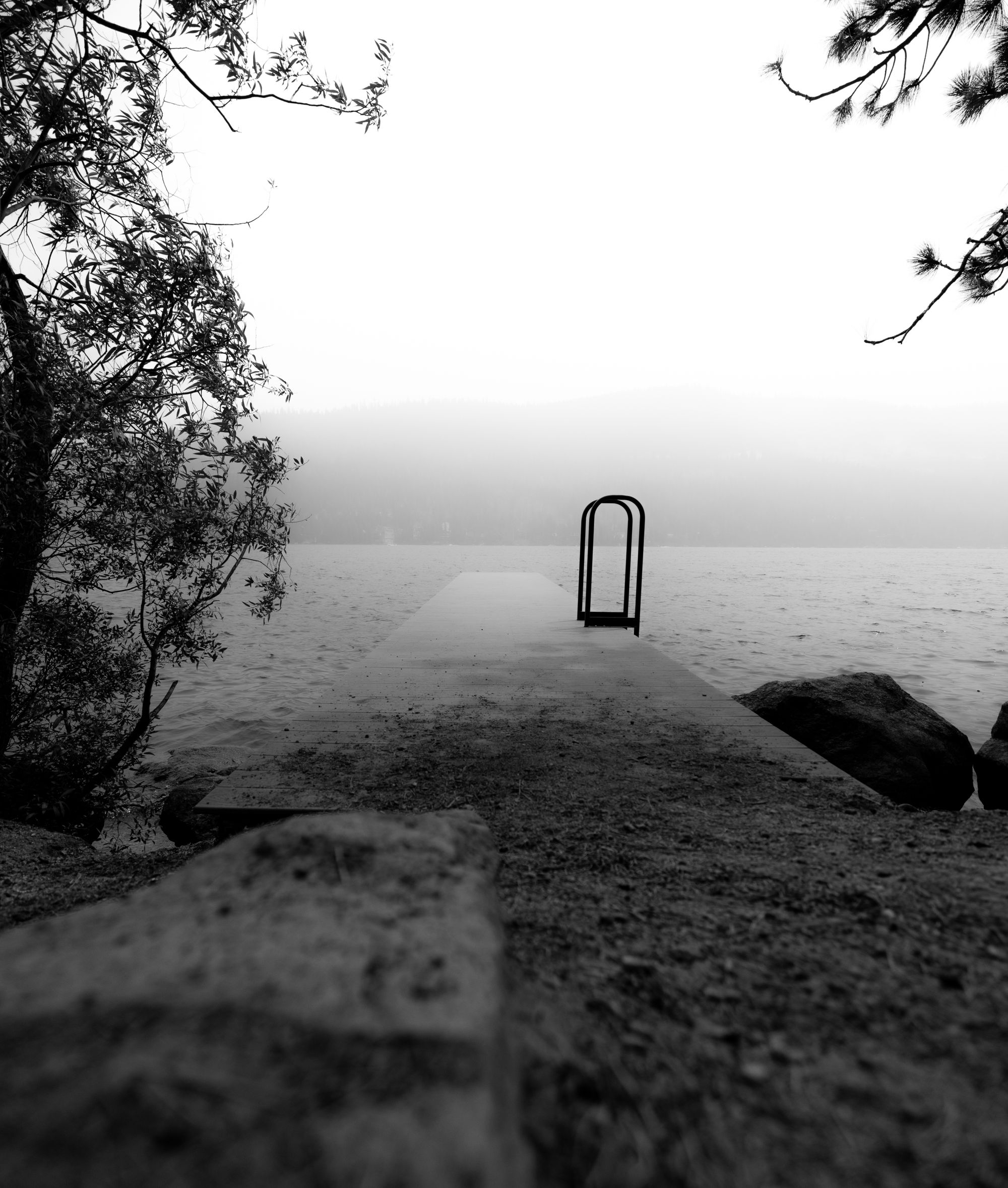
Goal: If you are by a lake, the empty dock photo feels like a necessity.
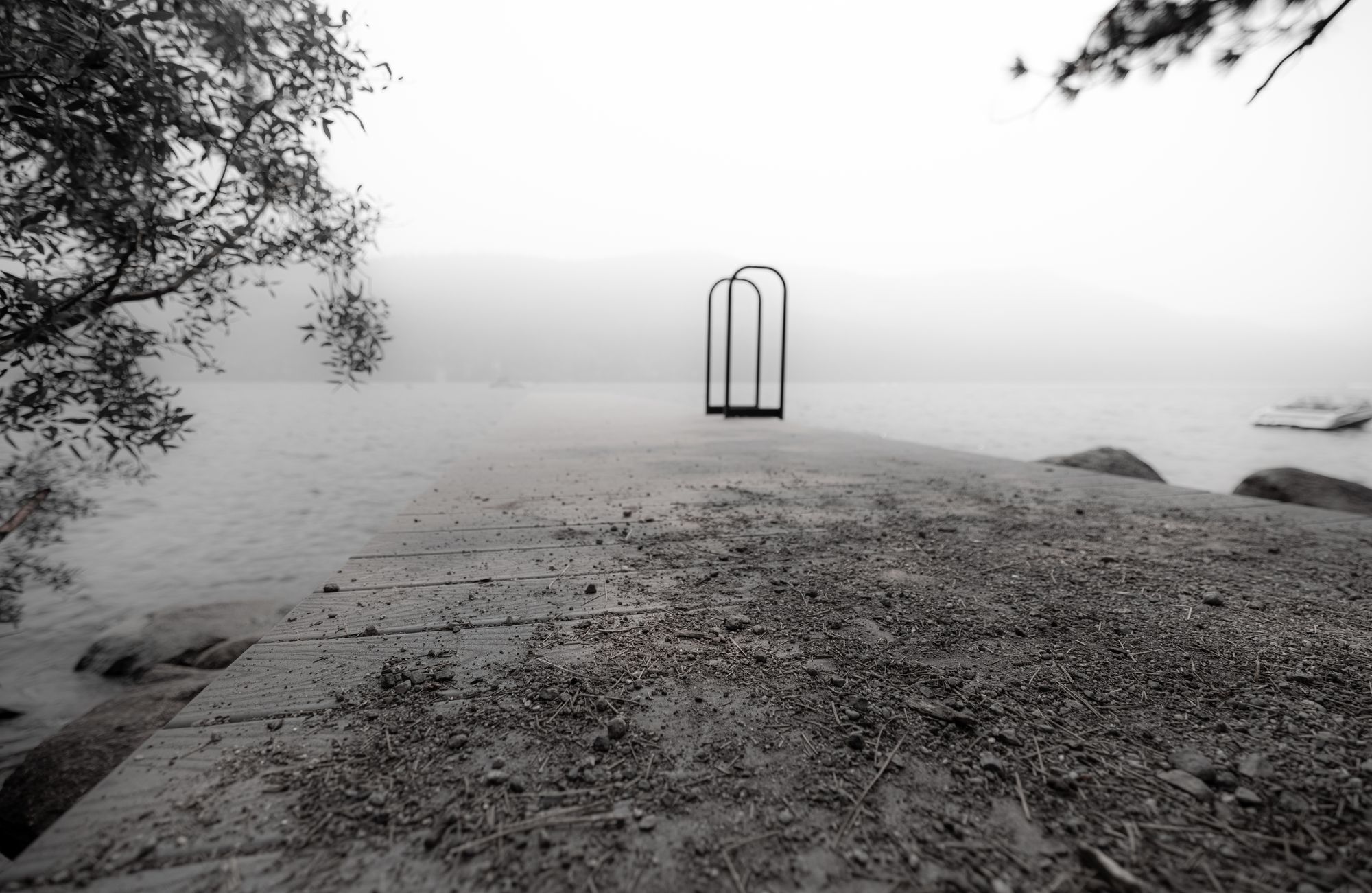
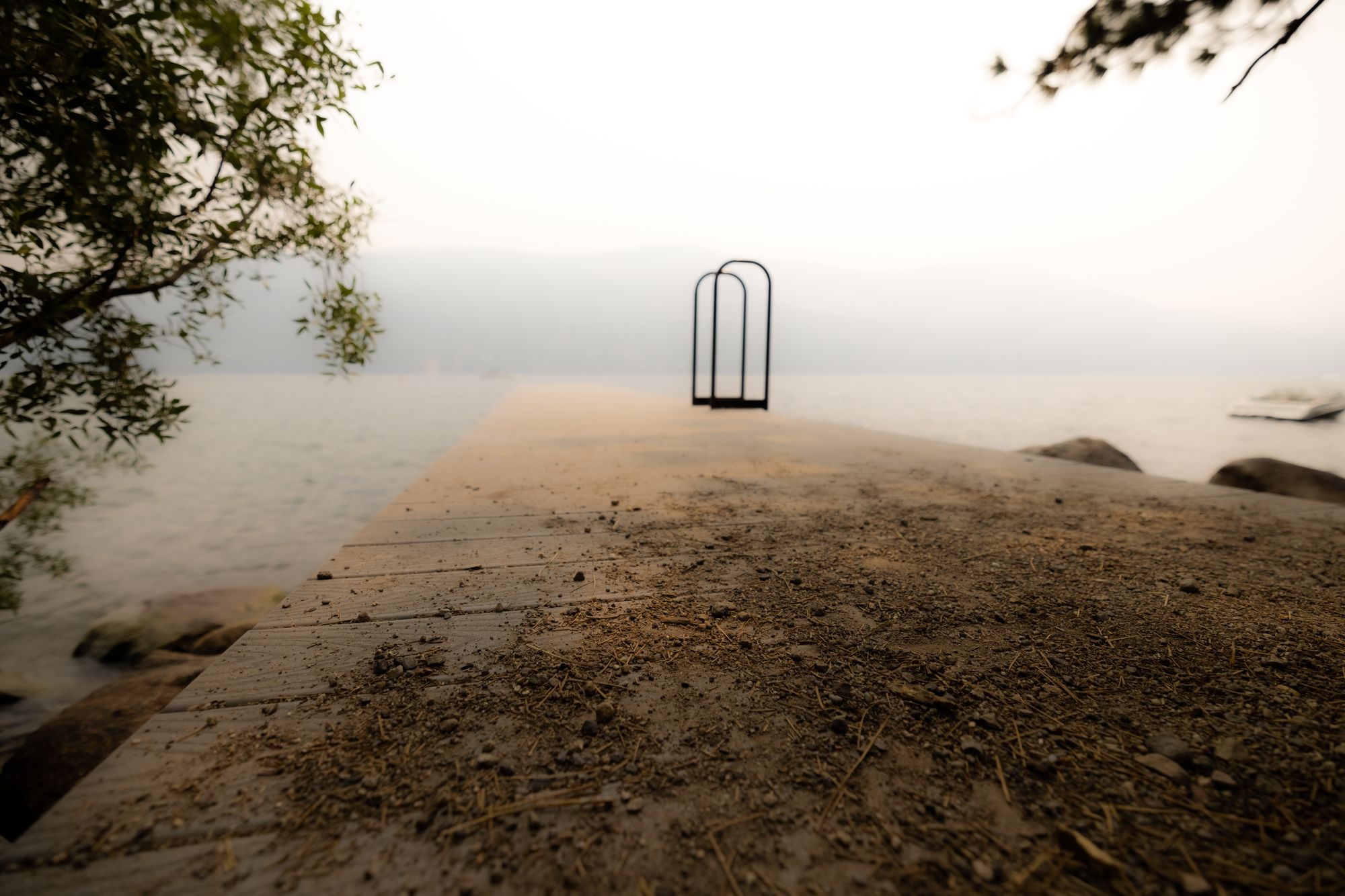
Something about this really made me want to do black and white. Easy and just dropping the saturation slider. I'm torn between these two and like aspects of both. Nothing too fancy with either of these. Once again I dropped the texture/clarity for more of a mysterious feeling, but then I wanted to get some of that back on the dock.
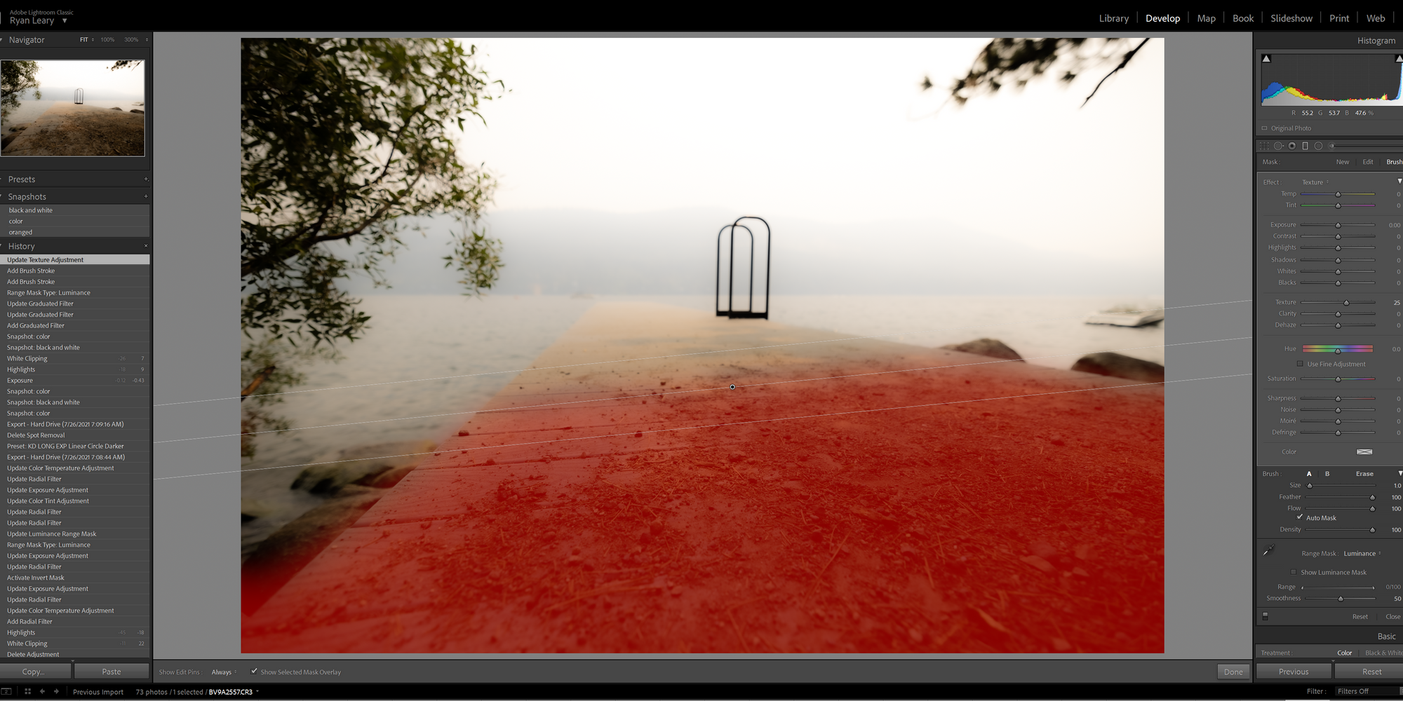
I took some others, but don't like these quite as much. Some of the black and white rock ones are kind of cool though. This is where I started to play with the fake orange sky at first, but I couldn't figure out how to not have it affect the leaves of the trees so much.
Screwing around
Photo session done. I'd left my sunglasses at the back of the dock and walking back saw a fun reflection, so I decided to play with that a bit.
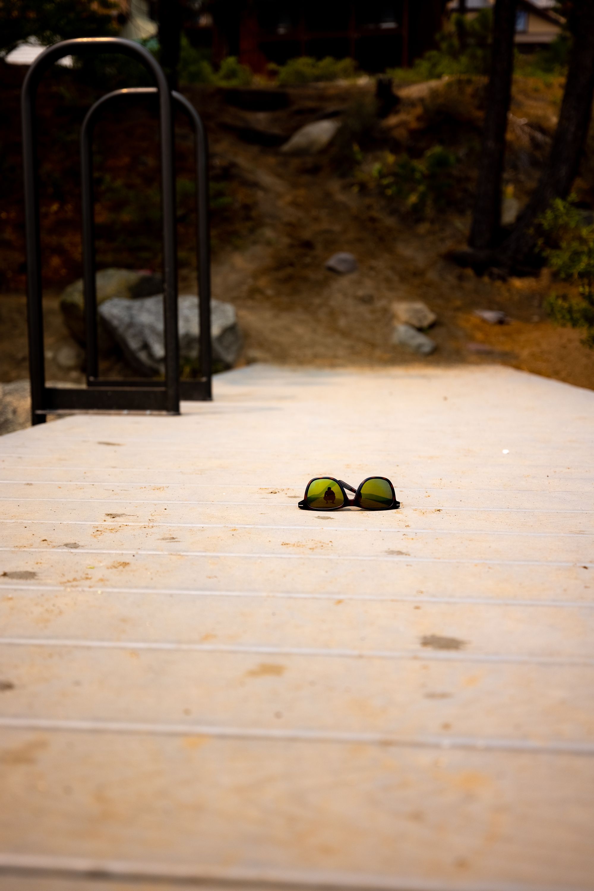
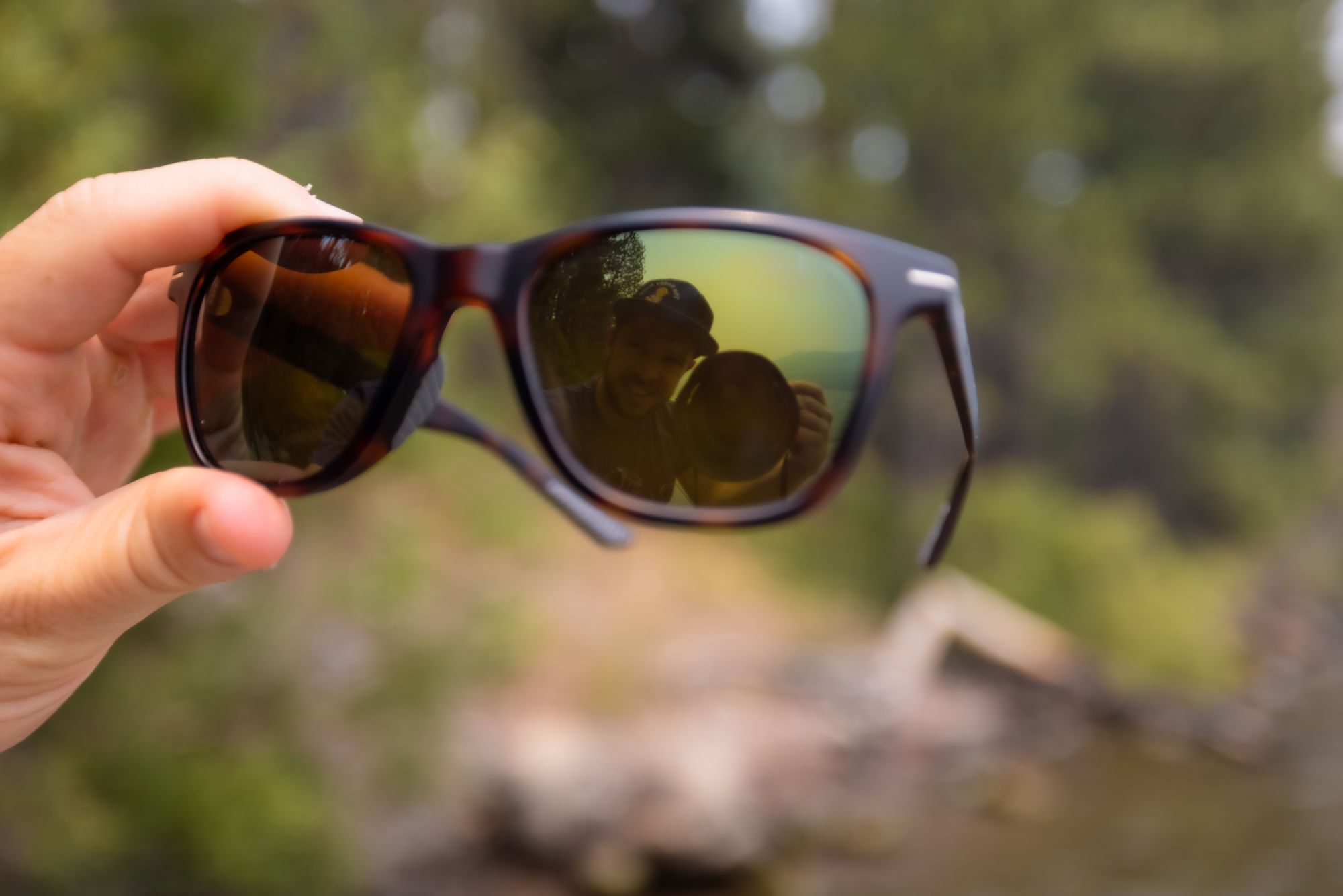
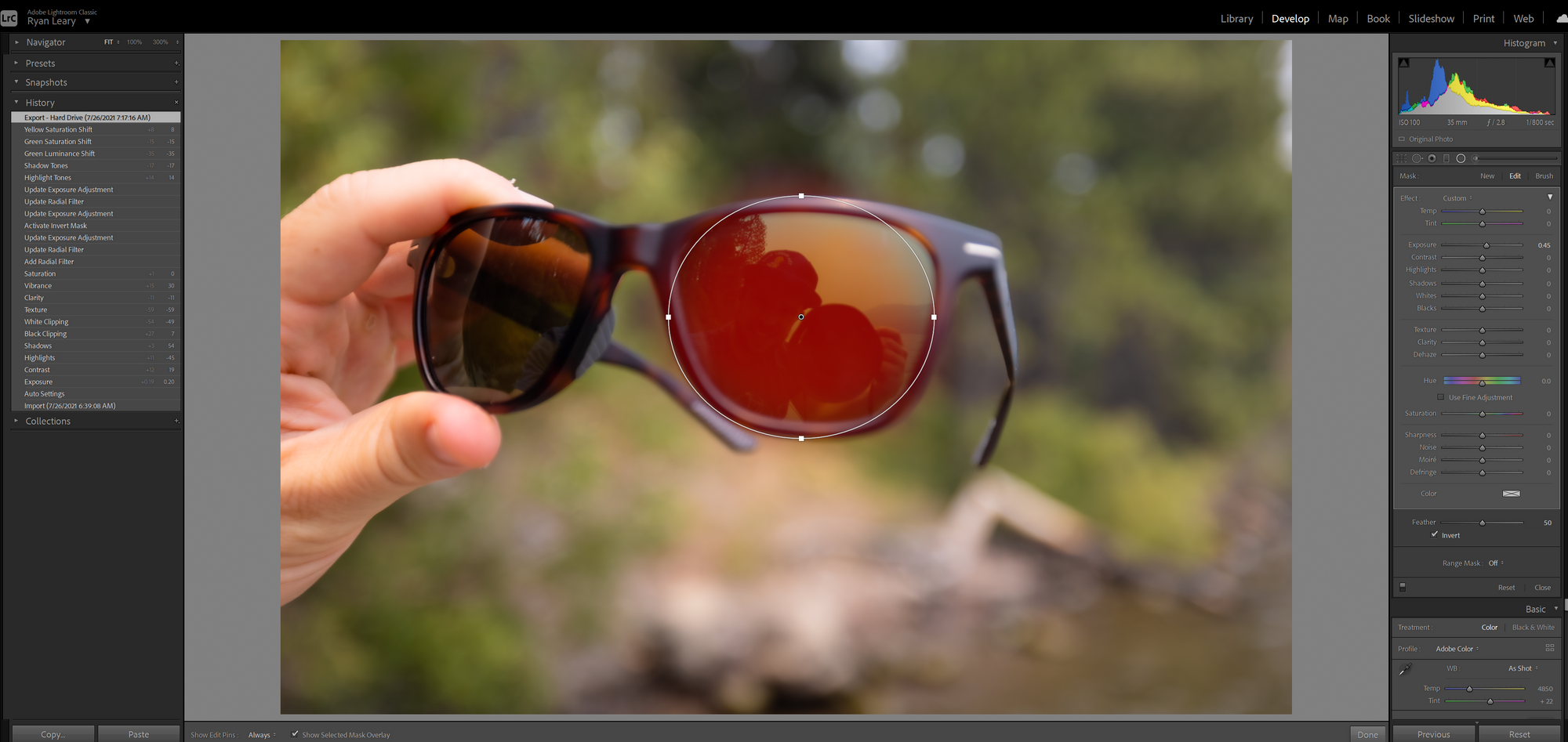
Really quick edits on these. I didn't get fancy beyond running down the sliders in 30s and then making MY FACE stand out a little more.
Summary
None of these stand out as amazing photos to me. This was more about putting in the reps and seeing what I learn along the way.
Main lesson: composition of an empty dock is hard to get that awesome feeling. I need to go study up on others and see what they do to make it really pop.
Secondary lesson: A camera gets heavy holding it one handed with a bum shoulder.
Lastly, we need to really address this issue. The current plans are laughable and depressing.


