Researching Maui photography, I was regularly drawn to images with a palm tree growing out of the foreground. Pair this with sunset and I'd have a certified fresh pic. Easier said than done with shadows the sun your eyes and all.
Quite frankly, this was the most frustrating photo edit I think I've ever worked on. I started over multiple times. It was so annoying because....the iPhone snap I created and spent 1 minute in lightroom on...I just like more. Here we go...
iPhone
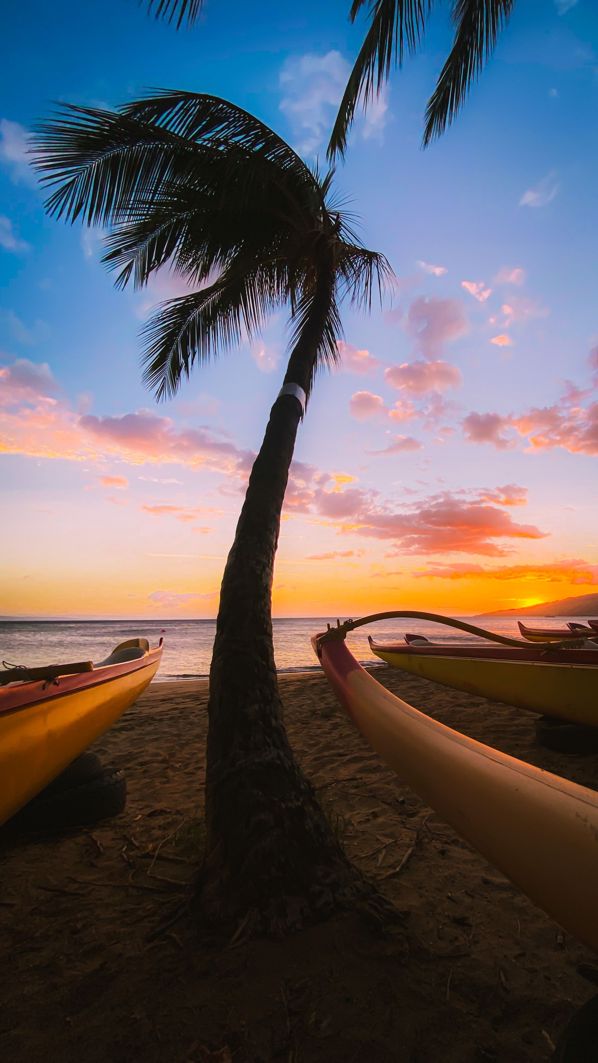
Done with shooting, I pulled out my iPhone, shot this, and tweaked it in Lightroom while riding back home. Great for a quick social post. The green halo around the leaves makes it unprintable. And there's kind of a green/yellow film across it all that reminds me of bile.
One thing I really like here is the framing. I need to return to retake the shot. All the others I took with the canon I was back further.
Attempt 1
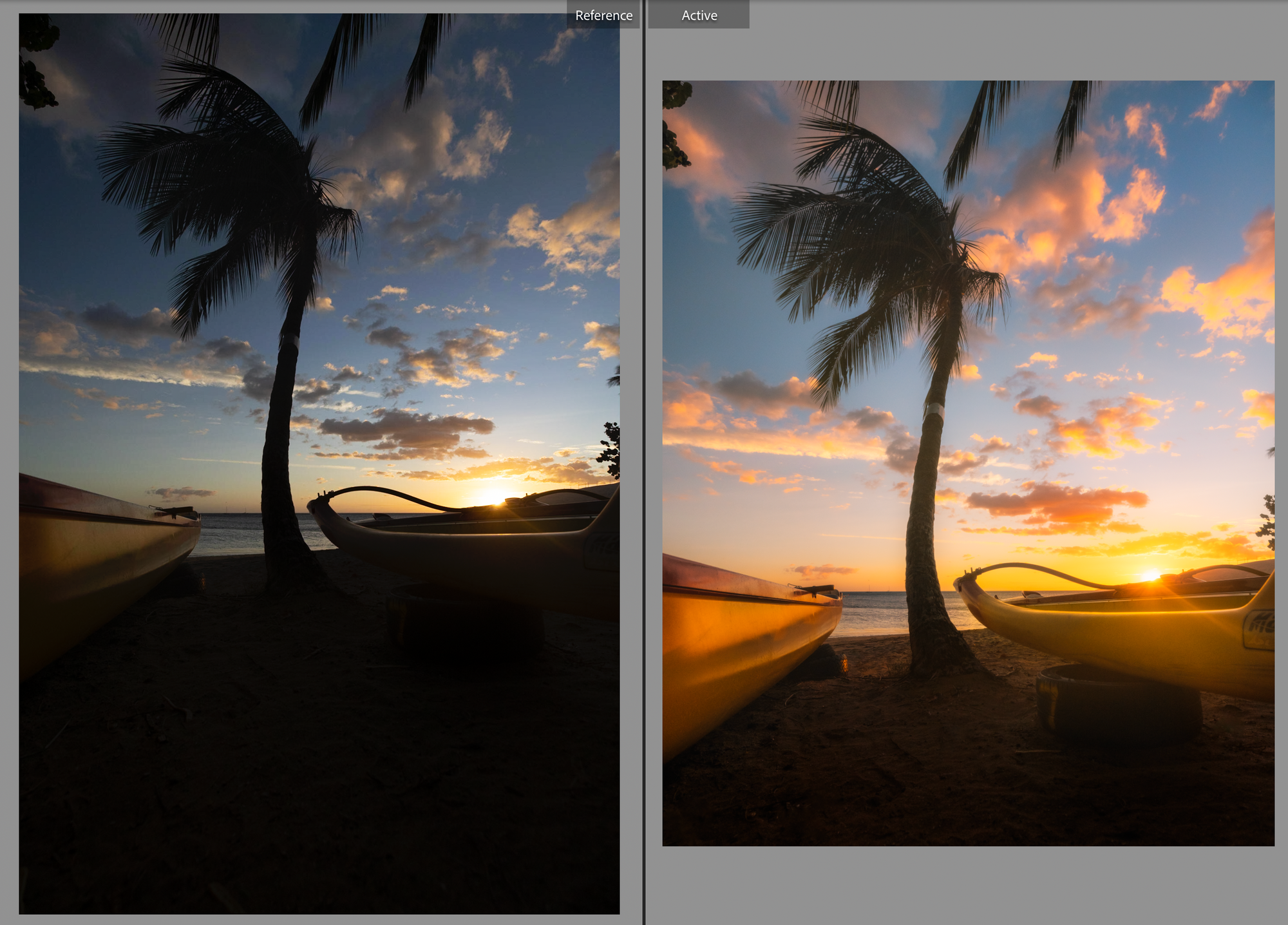
This took me 2 hours. I felt like I kept fighting things. I tried some exposure stacking. I moved every slider in every direction. I tried some photoshop magic. It's not bad, but...I just didn't like it. I looked back at the iPhone shot and liked it more overall. Meh. I went to sleep.
Attempt 2
Charged up with coffee and 7am football, I dove back in. I picked another image from the shoot and got going. Nothing was coming together. I walked away.
Attempt 3
I went back to the original image. 4113.CR3. It was time to do battle. I clicked Reset and began again, with the pains of things from last night still fresh.
Part 1: Lightroom
The goal here was to get the photo mostly looking the way I wanted. Normally I embrace more contrast and saturation. Poppy colors, dark blacks, and light whites - I'm into it. But now I'm learning...I can get A LOT of this in photoshop. Better to go very subtle in lightroom to get basics in place and then punch it up later with more particular selections. I did my best to show some restraint and got here:
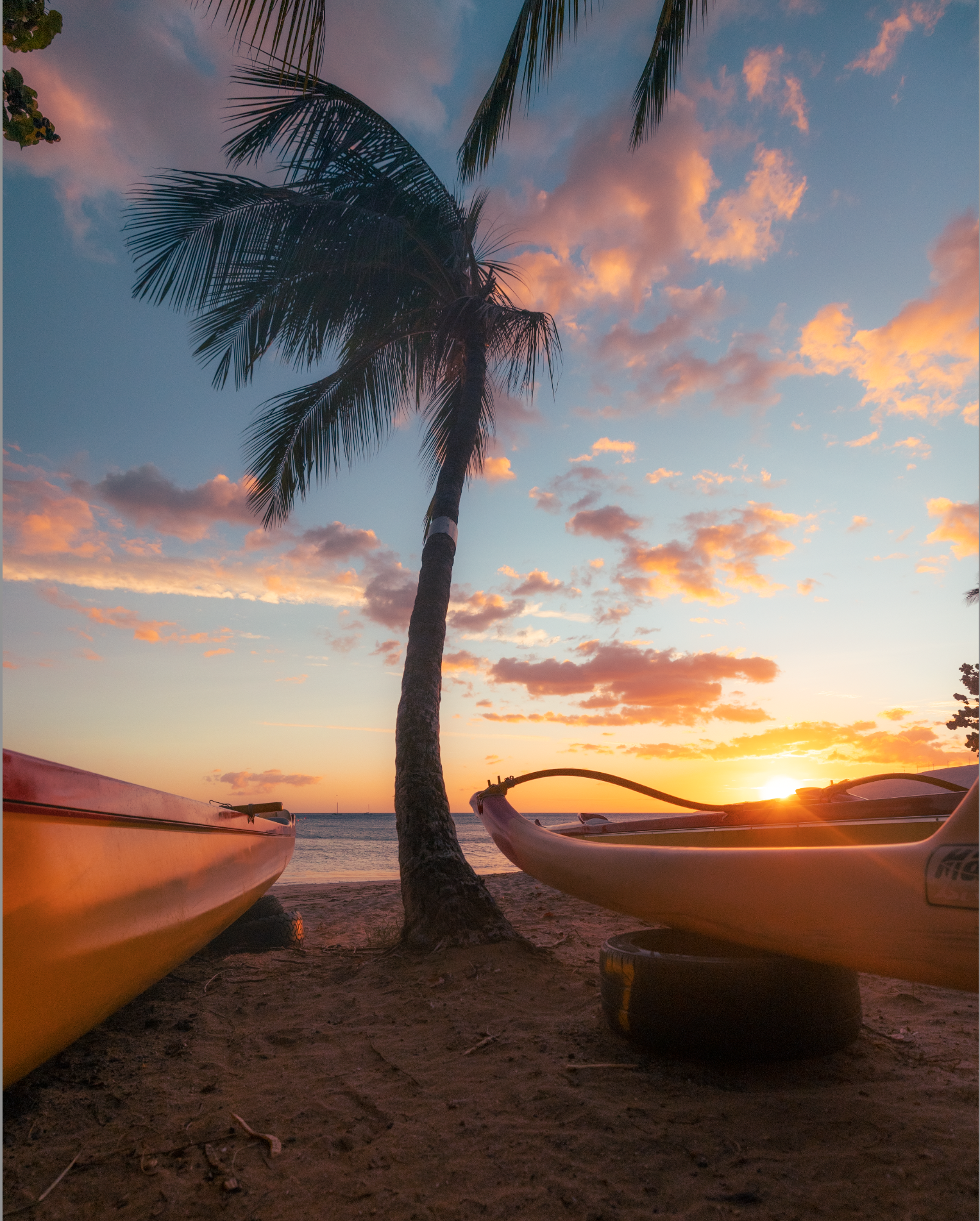
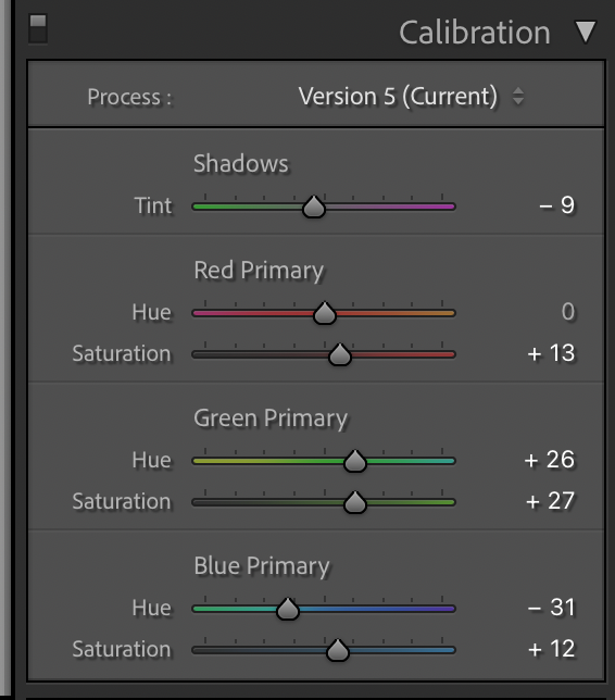
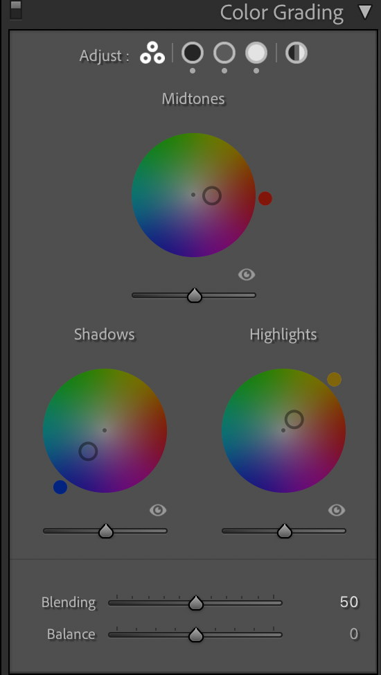
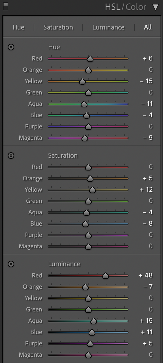
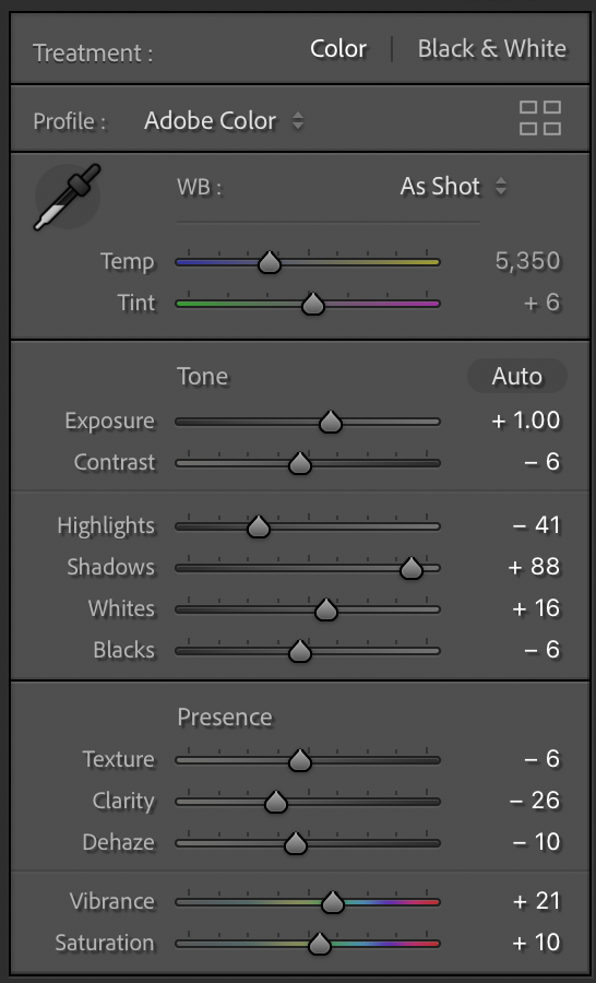
Essentially I aimed to:
- drop the brights
- raise the darks so you can get some definition in the tree
- light the sky on fire, but don't introduce ugly banding with saturation/vibrance
Decreasing contrast and dehaze was really helpful to keep things in line.
Part 2: Selective changes in Photoshop
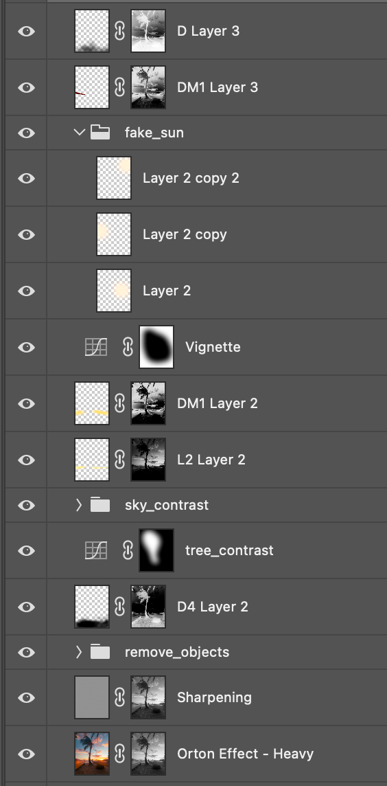
Photoshop was all about targeting specific areas to make selective changes.
- Make the sky mo' dreamy
- Update paint job on the boats
- Remove some sticks and twigs
- Darken the foreground, no need to look there
- Make the tree pop a little
- Give the clouds a little more love


Conclusion
iPhones are incredible.
I have a lot of time on my hands when there's no TV/Xbox around.
But really - I'm happy with my actual edit work here. It's a picture I'm actually proud of. I still like the composition of the iPhone shot a little more, but prefer my final canon shot than iPhone now.
I'm learning more and more about the tools available to me and kind of know when to use them. My overall start to finish workflow still feels like a bit of a mess, and it takes way too long, but I can live with it for now, especially while on PTO.


